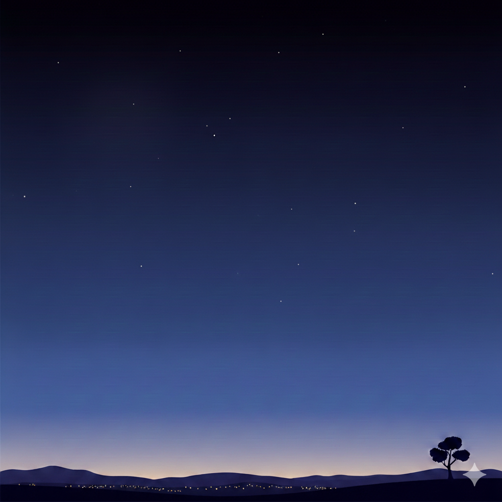
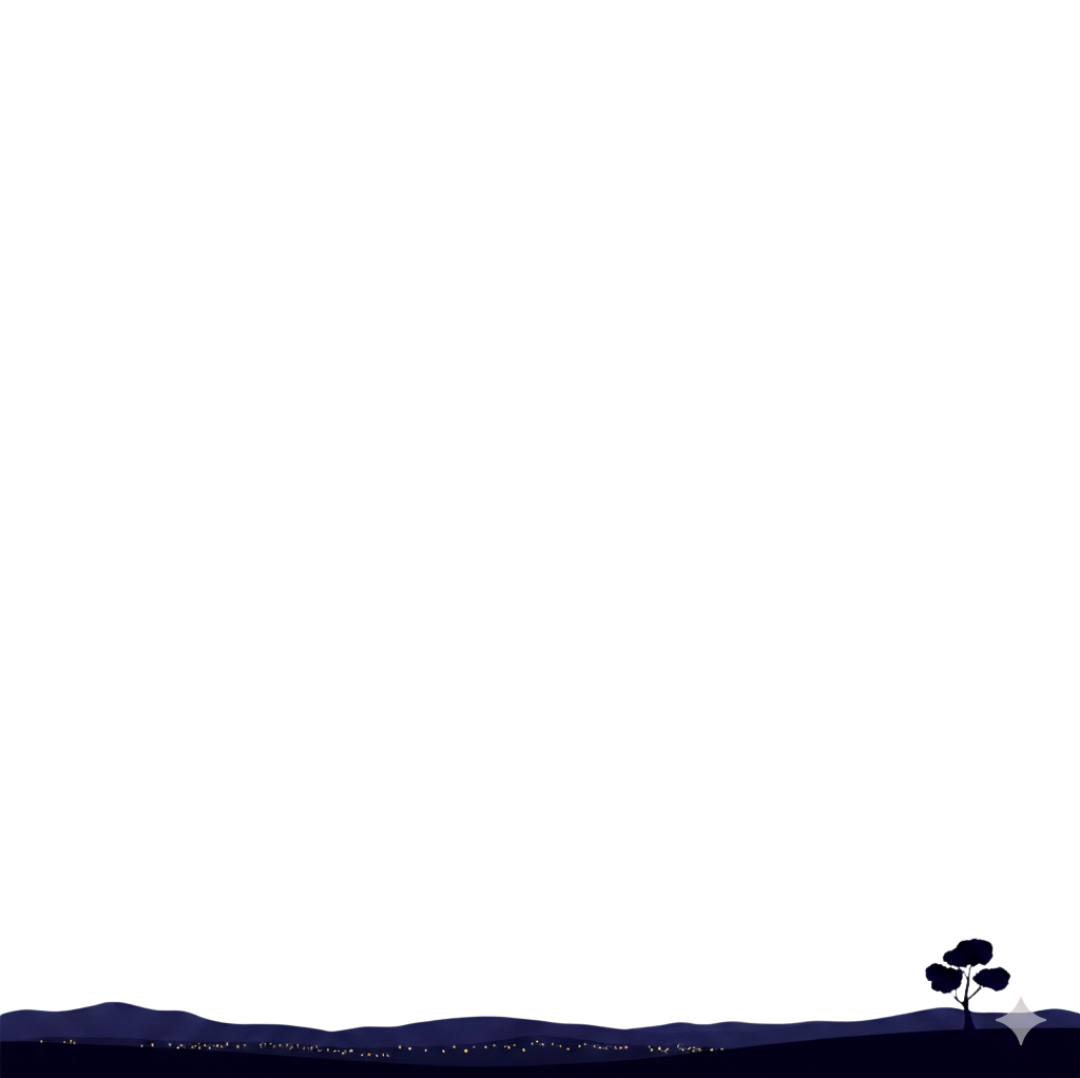
スマホの画面で流れ星が山の向こうに消えるようにCSSで山の画像(透過PNG)を重ねる
コードエディター 本文
<div class="image-container" id="container>
  <div class="star-container" id="starContainer">
    <img src="ここにベースの画像のURL" class="bg-image" alt="夜空">
  </div>
  <img src="ここに上に重ねる画像のURL" alt="重ねる画像" id="overlay" class="overlay-img">
</div>
カスタムJavaScript
    const container = document.getElementById('starContainer');

    // 星を作成する関数
    function createStar() {
        const star = document.createElement('div');
        star.classList.add('shooting-star');

        // ランダムな設定

        // 1. 出現位置 (右側のどこか、または上側のどこかからスタートさせる)
        // 画面の幅より少し右、または上からランダムに配置
        const startX = Math.random() * window.innerWidth + 200;
        const startY = Math.random() * -200; // 画面の上の方(見切れ位置)

        star.style.left = `${startX}px`;
        star.style.top = `${startY}px`;

        // 2. サイズ(長さ)のランダム化
        const scale = 0.5 + Math.random(); // 0.5倍 〜 1.5倍
        star.style.width = `${100 * scale}px`;

        // 3. アニメーション速度のランダム化
        const duration = 2 + Math.random() * 2; // 2秒 〜 6秒
        star.style.animationDuration = `${duration}s`;

        // コンテナに追加
        container.appendChild(star);

        // アニメーションが終わったら要素を削除 (メモリリーク防止)
        star.addEventListener('animationend', () => {
            star.remove();
        });
    }

    // 一定間隔で星を生成する
カスタムCSS
    /* 1. コンテナのスタイル (ここが星の表示領域になります) */
    .star-container {
        position: relative;
        width: 100%;
        height: auto; /* 幅に合わせて表示 */
        background-color: #000; /* 画像がない場合の背景色 */
        overflow: hidden; /* 画面外に出た星を隠す */
    }

    /* 背景画像の設定 */
    .bg-image {
        width: 100%;
        height: auto;
        object-fit: cover;
        opacity: 0.8; /* 星を見やすくするために少し暗くする */
        display: block; /* 画像を重ねる準備「ブロックレベル要素として扱うための指定」 */
    }

    /* 2. 流れ星の基本スタイル */
    .shooting-star {
        position: absolute;
        top: 0;
        left: 0;
        width: 20px; /* 星の尾の長さのベース */
        height: 1px;  /* 星の太さ */
        background: linear-gradient(90deg, #fff,rgba(255,255,255,0)); /* 白から透明へのグラデーション */
        animation: shoot 2s linear; /* アニメーションの定義 */
        opacity: 0; /* 最初は隠しておく */
        pointer-events: none; /* クリックなどを邪魔しないように */
        box-shadow: 0 0 10px #fff; /* 光っているような効果 */
    }

    /* アニメーションの定義(右上から左下へ) */
    @keyframes shoot {
        0% {
            transform: translate(0, 0) rotate(-45deg) scale(1);
            opacity: 1;
        }
        70% {
            opacity: 1;
        }
        80% {
            /* 移動距離。X軸マイナス、Y軸プラスで左下へ */
            transform: translate(-100vh, 100vh) rotate(-45deg) scale(1);
            opacity: 0;
        }
    }

    /* ここから画像を重ねる処理 (先に.bg-imageに display: block;を入れておく) */
    .image-container {
        position: relative; /* 子要素の基準点になる */
        display: inline-block;
    }

    .overlay-img {
        position: absolute; /* 親要素を基準に配置 */
        top: 0px;         /* 上からの位置 */
        left: 0px;        /* 左からの位置 */
        width: 100%;      /* 重ねる画像のサイズ */
        pointer-events: none; /* 下の画像へのクリックを邪魔しない場合 */
    }