

コードエディター 本文
<div class="container">
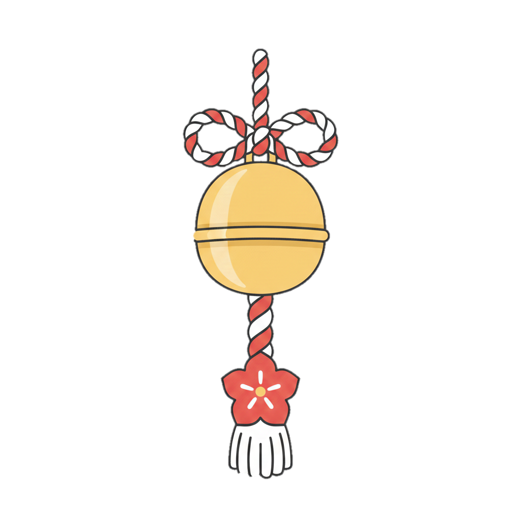
<img src="ここに背景画像のURL" alt="背景画像" class="base-img">
<img id="target-img" class="swing-img" src="ここに揺らす画像のURL" alt="">
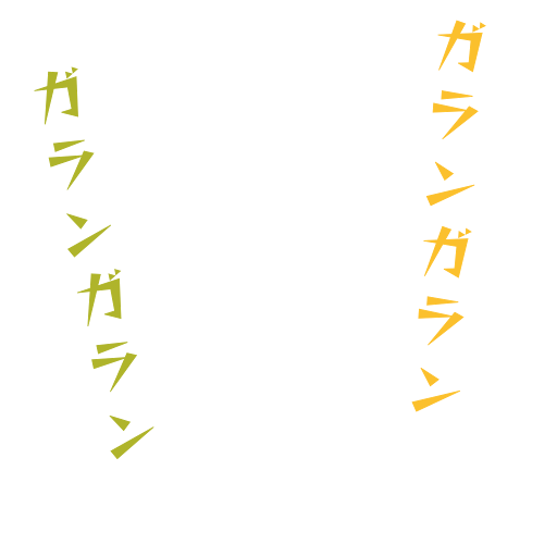
<img id="fixed-effect" class="swing-img" src="ここに3番目のエフェクト画像のURL" alt="" style="display: none;">
</div>
<button onclick="startSwing()">ボタン</button>
カスタムJavaScript
function startSwing() {
  const img = document.getElementById('target-img');

const effect = document.getElementById('fixed-effect'); // 3枚目を取得

  // すでにアニメーション中の場合は一度リセット
  img.classList.remove('swing-animation');

  // ブラウザに描画を反映させるためのハック(強制再描画)
  void img.offsetWidth;

  // アニメーション開始
  img.classList.add('swing-animation');

  // --- 3枚目(固定画像)の表示処理 ---
  effect.style.display = 'block';

  // もし「2秒後に自動で消したい」場合は以下を追加

  setTimeout(() => {
    effect.style.display = 'none';
  }, 2000);
}
カスタムCSS
.container {
    position: relative;  /* 子要素の基準点 */
    perspective: none; /* 削除 */
}

.base-img {
    display: block;
}

.swing-img {
    position: absolute;  /* 親要素を基準に自由に配置 */
    top: 0px;           /* 上から0pxの位置 */
    left: 0px;          /* 左から0pxの位置 */
}

#target-img {
    width: 512px;
    transform-origin: top center;
    /* 画像そのものに視点を設定すると、どこにあっても真正面から揺れます */
    transform: perspective(600px) rotateX(0deg);
}

/* 揺れるアニメーションの定義 */
.swing-animation {
    animation: swing-back-forth 2s ease-in-out forwards;
}

@keyframes swing-back-forth {
    0% { transform: perspective(600px)  rotateX(0deg); }
    20% { transform: perspective(600px) rotateX(30deg); }   /* 前に倒れる */
    40% { transform: perspective(600px) rotateX(-20deg); }  /* 後ろに倒れる(少し減衰) */
    60% { transform: perspective(600px) rotateX(15deg); }   /* 前に(さらに減衰) */
    80% { transform: perspective(600px) rotateX(-10deg); }  /* 後ろに(さらに減衰) */
    100% { transform: perspective(600px) rotateX(0deg); }   /* 停止 */
}

button {
   padding: 15px 30px; /* 上下15px、左右30px */
   font-size: 18px;    /* 文字も大きくするとバランスが良い */
}